


Great branding isn’t just about a logo or a catchy slogan – it’s about creating a distinct identity that resonates with the right audience.
From playful and bold to sleek and professional, the most successful brands craft strategies that align with their values, product, and target market.
Let’s take a look at some standout examples and what makes their branding so effective.
Clay
Clay represents an innovative approach to B2B software marketing, challenging the traditional corporate formality typically associated with enterprise sales.
Their distinctive strategy centers on educational partnerships rather than conventional sales teams – a move that effectively demonstrates their product's value through authentic user perspectives.
Their content strategy boldly embraces humor and internet culture, incorporating meme-style videos and witty social posts that resonate with their tech-savvy audience.
This approach proves that B2B communication doesn't need to be dry to be effective – in fact, their willingness to inject personality and levity into their content helps them stand out in a traditionally straight-laced market.
The peer-to-peer learning model not only builds credibility but also creates a community of engaged users who can showcase real-world applications of the software.
Their brand identity is remarkably cohesive, with their playful tone of voice complemented by a unique visual design system that cleverly incorporates clay-like elements.
This consistent commitment to their brand concept, from name to visual execution, creates a memorable and approachable presence in a sector often dominated by sterile corporate aesthetics.
Clay's success demonstrates that B2B brands can effectively engage professional audiences while maintaining a distinct personality – proving that enterprise solutions don't need to sacrifice character for credibility or humor for professionalism.
Notion
Notion is another B2B brand that has mastered the balance between professionalism and creativity. One of their standout branding moves is their signature hand-drawn profile images, which all employees use on LinkedIn.
They even turned this into an interactive social campaign, launching a platform where anyone could create their own doodle-style avatar. It was a smart, shareable way to increase brand visibility – after all, people love personalizing their online presence.
This sketch-like aesthetic aligns perfectly with Notion’s core offering: a flexible, all-in-one workspace for writing, planning, and collaborating. The hand-drawn elements evoke a sense of brainstorming and creativity, reinforcing the idea of a tool designed for dynamic, organic workflows.
Their messaging is just as clear and direct – when you land on their homepage, you’re immediately greeted with: “The happier workspace. Write. Plan. Collaborate. With a little help from AI.” In one line, they communicate exactly what Notion does and how it enhances productivity.
Notion also embraces user-generated content to build an authentic, community-driven brand. A great example is their video campaign in Berlin, where they asked employees to describe Notion in a single sentence.
The final edit is sleek, featuring quick cuts, upbeat music, and a diverse mix of voices, making it feel fresh, engaging, and effortlessly cool. By blending clarity, creativity, and a strong sense of community, Notion has positioned itself as more than just a productivity tool – it’s a brand that feels both inspiring and personal.
Pabst Blue Ribbon
Pabst Blue Ribbon (PBR) has built its brand on authenticity, adaptability, and a deep connection to local culture. Rather than dictating what Pabst should represent, the company embraced a more organic approach.
As former Lifestyle Marketing Manager Steve Nilsen put it, “We never, ever, told consumers what Pabst was. We let them decide that for themselves.”
This strategy extended to their grassroots marketing efforts. Field marketers had the freedom to tailor PBR’s positioning to their local scenes, ensuring the brand resonated with different subcultures. Whether in dive bars, indie music venues, or skate parks, Pabst became a beer that fit in naturally rather than forcing itself into the conversation.
PBR’s unpolished, independent image was further solidified by its unconventional response to the 2007-2009 recession. Without the massive advertising budgets of brands like Budweiser or Coors, Pabst relied on word-of-mouth and cultural credibility.
“There was no marketing being shoved down people’s throats,” Nilsen explained. “Pabst wasn’t Budweiser or Coors. It was spontaneous and honest and never fake. It’s the independent little scrappy brand, and everybody wants to support the little guy.”
The brand’s visual identity played a crucial role in its success. The iconic blue ribbon-adorned can was instantly recognizable and carried an effortless cool factor. As Nilsen noted, “It’s a beautiful can. You can recognize it from a mile away. People felt cooler when they had that can in their hand. It gave them an edge.”
Pabst also leaned into nostalgia, leveraging its rich history to reinforce its authenticity. From rediscovering old advertising materials – including a 1979 commercial featuring a young Patrick Swayze – to embracing its budget-friendly yet stylish appeal, PBR positioned itself as “top of the sub-premium” category.
This ability to blend affordability with a strong brand identity cemented Pabst as a cultural staple, proving that great branding doesn’t always require a big budget – just the right kind of storytelling.
La Vie
La Vie is a bold and playful vegan brand specializing in plant-based pork alternatives. Their branding is vibrant, humorous, and full of personality – centered around their mascot, "Mr. Piggy," a pig who ironically champions their vegan products.
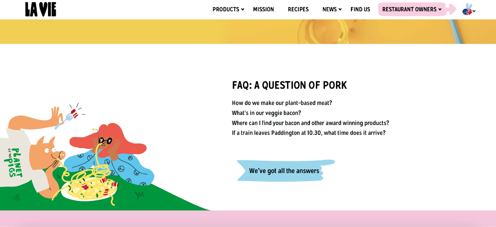
Comedy is at the heart of their identity, evident in their witty marketing, such as their FAQ section, which ends with a lighthearted, unrelated question: “If a train leaves Paddington at 10:30, what time does it arrive?”
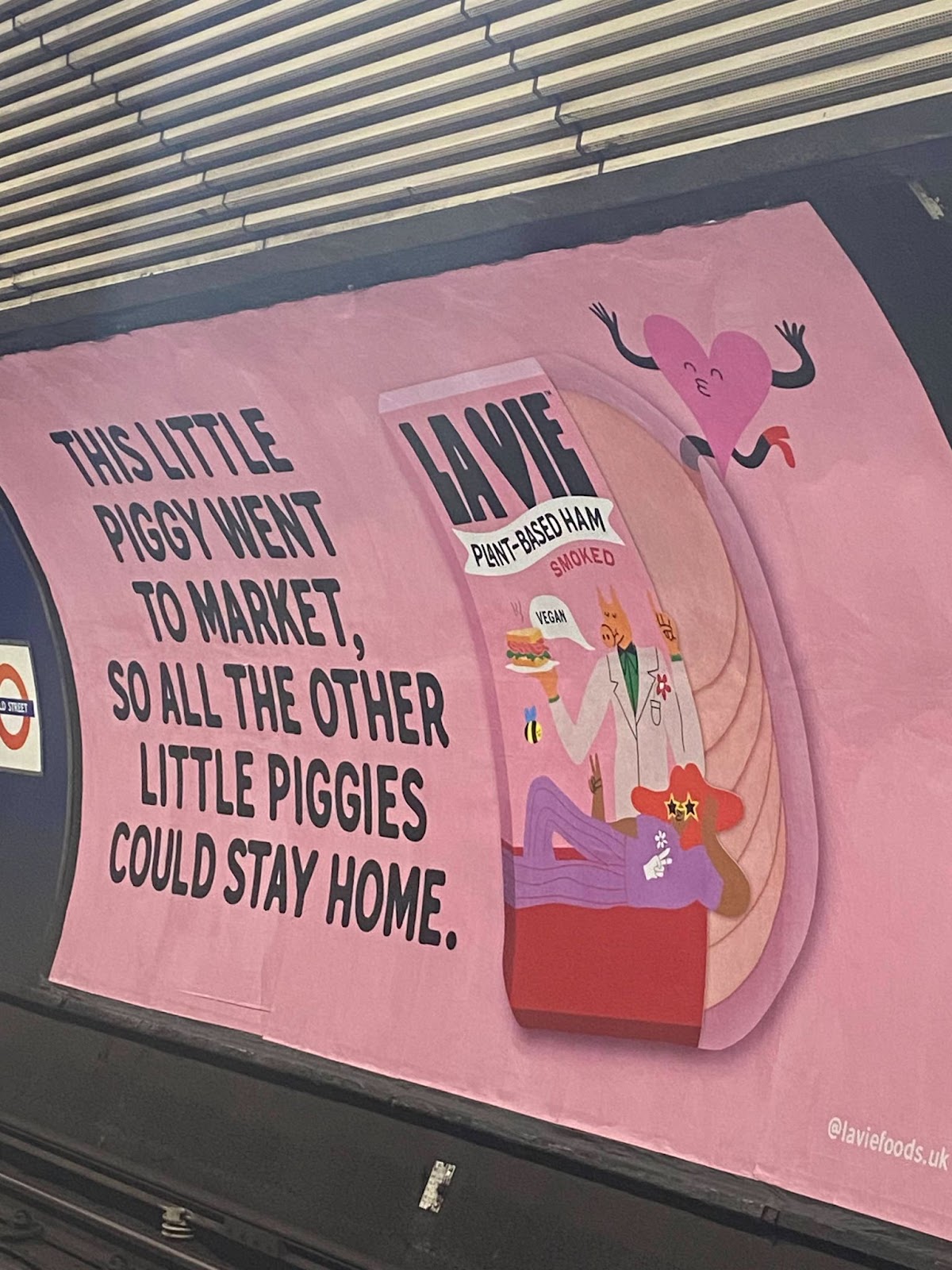
This cheeky tone extends to their advertising, like a London Underground ad that cleverly reworks the classic nursery rhyme: “This little piggy went to the market, so all the other piggies could stay home.” The message is clear – choosing La Vie isn’t just about taste, it’s about saving lives.
Visually, La Vie leans into a fun, pink, cartoon-inspired aesthetic that reinforces its approachable and engaging identity.
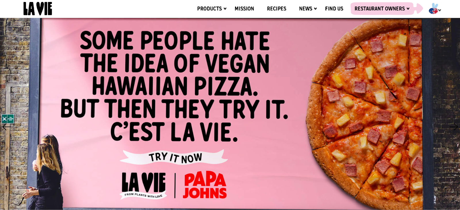
They also integrate their brand name into their copy for added flair, as seen in lines like: “Some people hate the idea of vegan Hawaiian pizza. Until they try it. C’est La Vie.”
This combination of humor, nostalgia, and emotional resonance makes their branding both memorable and effective, positioning them as a standout player in the plant-based food industry.
Surreal
Surreal has emerged as a notable disruptor in the food and beverage space, generating significant discussion around their platform-specific marketing approach.
While some critics argue their LinkedIn presence misses the mark by seemingly targeting marketers rather than their core consumer base, this appears to be a calculated element of their multi-channel strategy.
Their LinkedIn campaign demonstrates sophisticated audience segmentation, leveraging wit and industry-savvy content that resonates specifically with business professionals.
This approach builds brand affinity among a demographic likely to appreciate their meta-marketing style, potentially converting this appreciation into customer loyalty and purchase decisions.
Meanwhile, their Instagram presence shows careful platform adaptation while maintaining brand consistency. Their content there skews toward video-first, user-generated style content that aligns with platform norms, while preserving their characteristic satirical tone.
This dual-platform strategy showcases Surreal's ability to flex their brand voice across channels while maintaining a cohesive identity that speaks authentically to each platform's unique audience.
Final thoughts
The one thing that connects all of these companies is that, whether they’re B2B or B2C, they stay true to what works for their product, maintain a consistent tone of voice, and always think about who they’re marketing to.
Their success isn’t just about great design or clever messaging; it’s about understanding their audience and creating an emotional connection.
So, what can you learn from them?
Take a step back and ask yourself: What makes your brand unique? How do your customers feel when they interact with it?
Whether you’re refining your tone of voice, rethinking your visuals, or exploring new ways to engage your audience, keeping these questions in mind will help shape a brand that truly stands out.


Product marketing insider
Thank you for subscribing
Level up your product marketing career & network with product marketing experts.
An email has been successfully sent to confirm your subscription.
 Follow us on LinkedIn


.svg)
Start the conversation
Become a member of Product Marketing Alliance to start commenting.
Sign up now