


Numbers are one of the single most important aspects of anything you do as a product marketer - but we didn’t need to tell you that. With multiple segments, sources, campaigns, channels, and potential products to contend with though, extracting meaning from all that data can feel like an uphill battle. So, to help you get the most out of every digit, here are some number-crunching tools lots of product marketers are happily using to scale their offering.
There are a ton of awesome product marketing tools on the market. The great news? We have 200+ that have been vetted and tested waiting for you in our PMM Tech Stack.
AppsFlyer
With mobile attribution, marketing analytics, people-based attribution, deep linking, fraud protection, smart banners, and audiences, AppsFlyer helps organizations measure everything from QR codes and email campaigns to social ads and in-app events.
Website: appsflyer.com
Cost: not available online.
Branch
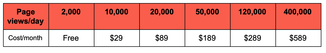
Focusing on measurement and deep linking, Branch is all about mobile growth. With link matching guarantees it ensures your links work across every platform and channel and your users experience a flawless journey - even after they leave to install your app.
On top of that, it joins the dots between cross-channel and platform journeys so you can trace a customer’s steps with confidence, optimise campaigns and maximise revenue.
Website: branch.io
Cost:
Google Analytics
We don’t need to tell you Google Analytics is vast, but some of its more popular features among the product marketing community include:
- Its behavioural flow reports
- Seeing where people click on a page
- Identifying popular on-page elements
- Understanding where people leave with Exit Pages
- Its A/B testing functions
- The ability to segment data by date, location and browser.
Website: analytics.google.com
Cost: Google Analytics is free. Google Analytics 360 comes with a price tag but it’s not available online.
Heap
By automatically capturing web, mobile and cloud interactions (like clicks, submits, transactions and emails), Heap lets you retroactively analyse the data needed to identify and act on information, such as: where are people dropping off? Which channels are and aren’t working? Which parts of the product are putting people off?
Website: heap.io
Cost: not available online.
Pendo
Pendo’s packed with tools to improve product adoption, customer loyalty and team innovation. Its analytics feature provides insights into what users are doing throughout their journey, its surveys capture how they feel about their experience, its in-app walkthroughs and messages encourage engagement, and its feedback tool helps prioritise future releases.
Website: pendo.io
Cost: not available online.
“After using Pendo to design in-app support for existing users and immediate onboarding for new ones, we saw a steep increase in engagement and retention that translated into direct earnings since our customers paid us by user engagement.”
Tom Heys, Go-To-Market Consultant
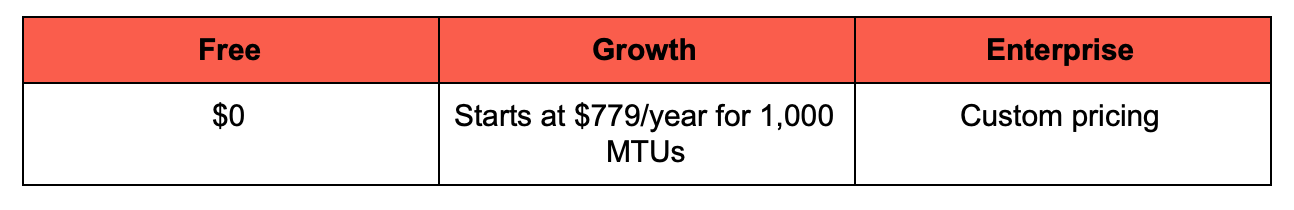
Gainsight
Gainsight’s Product Experience Platform provides the tools needed to get a deeper understanding of user behaviour, drive product adoption and collect feedback. How? By tracking users’ every movement (like clicks, logins and email opens), identifying where people fall off critical tasks, guiding inactive users back to your product via email, and so much more.
It’s also got some great Customer Experience, Customer Success, Customer Data and Revenue Optimisation products.
Website: gainsight.com
Cost: the price depends on how many monthly active users you’ve got. Based on 2,000, the cost would be $2,000/mo for a Starter Package (20% discount if you pay annually). You’ll have to schedule a call to get a cost for their Growth Package.
Hotjar
With heatmaps, video recordings, conversion funnels, form analysis, feedback polls and surveys, Hotjar creates just about an accurate picture as you can get in terms of visually understanding how customers navigate your product.
Website: hotjar.com
Cost:
“We use Hotjar to collect data from users on our website and blog. Typically, we set up polls as a low effort way to ask questions to users we couldn't otherwise communicate with because we don't have their email address.”
Dani Lichliter, Product Marketing Consultant
Mixpanel
Mixpanel hand-delivers real-time data so you can see how it performs against key metrics over time, pinpoint trends, understand what’s causing them and employ initiatives to engage, retain and convert. It uses things like correlation analysis and look-alike modelling to dive into the numbers and then prompts you to set improvement goals and create and test your hypothesis.
Website: mixpanel.com
Cost:
“This is my go-to for understanding the usage of our product. It helps me to slice and dice cohorts and map user behaviours to products. By getting really granular into these segmented groups (we have B2B and B2P customers) I can plan and execute really targeted in-app and email campaigns that drive usage and stickiness.”
Phill Brougham, Product Marketing Manager at Trint
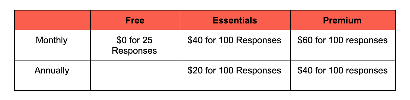
Qualaroo
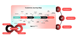
Qualaroo’s a user research tool with a difference: it was built with UX designers in mind and offers sentiment analysis. All you have to do is pinpoint areas in need of improvement along your current customer journey map, prototype a new experience to overcome any identified issues, share your new version with a selection of your community, collect their feedback, and then continue to refine and improve it.
Website: qualaroo.com
Cost:
Looker
Looker connects multiple data sources so every department can access the numbers they need without compromising on transparency, security or privacy. You choose your database, cloud and workflow, then Looker gets you up and running in a matter of days and pushes your data visualisations exactly when you need them.
Website: looker.com
Cost: not available online.
InsightSquared
The aim of InsightSquared’s game is to reduce business life cycles between receiving data and making informed decisions, and it does that by providing pre-built best practice and AI-driven reports, connecting multiple sources to one dashboard to create full-funnel views, enabling you to manage your renewals as a pipeline, and a whole load more.
Website: insightsquared.com
Cost: not available online.
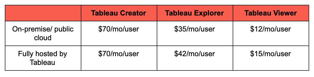
Tableau
Tableau puts powerful data at your fingertips so you can confidently respond to deep questions with meaningful answers.
Interactive dashboards, alerts and storytelling come as standard, easy organisation is evident throughout, and you can deploy your insights wherever you want. On-premise or cloud, Windows or Mac, Tableau integrates with your existing architecture too.
And if you need to export data from Tableau, or connect it to more platforms, there shouldn't be any blockers.
Website: tableau.com
Cost:
Sisense
Sisense is a data analytics platform that enables developers, data engineers and business analysts to instantly amalgamate huge amounts of data, analyse the results, decide how to deploy business intelligence (on-premises, in the cloud, or a hybrid approach), turn data into products, and so much more.
Website: sisense.com
Cost: not available online.
Qlik
Qlik’s an end-to-end data management and analytics platform that combines all your data, ensures it’s analysis-ready, and then makes it available across every team, process, application and device.
Website: qlik.com
Cost: pricing for their Data Integration and Developer Platform solutions aren’t available online. Billed annually, their Data Analytics packages are:
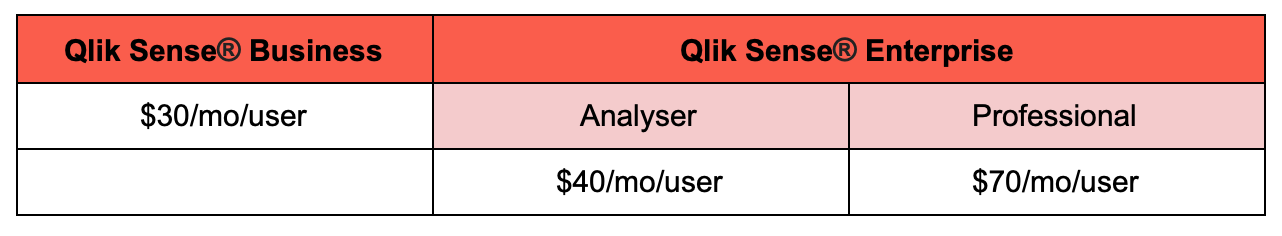
“A good deal of PMM work revolves around looking at customer adoption data and then building strategies for increasing that adoption. Qlik is a way to take data from one or more sources and then visualize it in a more digestible way. This is good both for analyzing data to make plans, but also for reporting out on success after an adoption campaign or over a period of time (like year-over-year).”
Landin King, Senior Product Marketing Manager at Compass
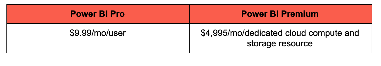
Power BI
Power BI transforms data into visuals that can be accessed on-premises and in the cloud to make informed decisions, quicker. Its dashboards are customisable, its reports are interactive and with built-in governance and security, it’s set-up to scale with you.
Website: powerbi.microsoft.com
Cost:
Mode Analytics
With Mode, you don’t have to hop between tools to analyse raw or modelled data with SQL, Python or R. You can do it all from one place.
Its Notebook and SQL Editor improve the speed and quality of iterative analysis. Its reports include D3, matplotlib, ggplot, and more. And its data stack’s compatible with others.
The result? The right data, to the right people, at the right time.
Website: mode.com
Cost: not available online.
Lucidchart
Lucidchart turns ideas, visions, org charts, projects and more into visual diagrams so you can decipher information easier and make decisions quicker. Used by 99% of Fortune 500 companies and with affordable price tags, it’s a force to be reckoned with.
Website: lucidchart.com
Cost:
Domo
With seamless integration, predictive AI, pre-built custom apps, scope for billions of rows of data and more, Domo connects data and brings it together in a way that delivers accurate insights and drives actionable decisions.
Website: domo.com
Cost: not available online.
“We use Domo for aggregation of all business data. From Salesforce to internal product data we summarize and report on it through Domo supported by our Business Ops team. I've used it for reporting on anonymized customer data trends and usage data. Our Customer Care team has dashboards for all customers which shows key statistics we've identified that predict customer health and churn.”
Alec Pinkham, Director of Product Marketing at AppNeta
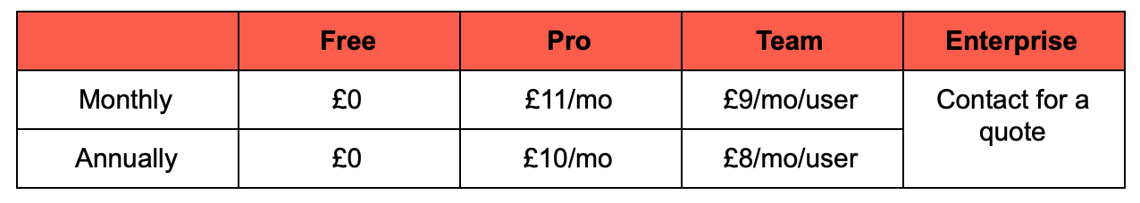
ChartMogul
If your product’s under a subscription business model ChartMogul provides analytic and recognition tools to improve retention and drive growth.
Subscription Analytics: real-time reports that can be sliced up by plan group, billing cycle, location and more.
Revenue Recognition: all your revenue data in one place and updated to the last second.
Mobile Subscription Analytics: connects to iOS and Google Play and unlocks info like monthly recurring revenue, churn rate and customer lifetime value.
Website: chartmogul.com
Cost:
Wanna check out even more nifty tools? Remember, there's a ton more waiting to be discovered in our PMM Tech Stack, home to a wide collection of reviewed and approved tools designed to polish your practice.
Want to learn more?
Needing to measure your product marketing success is a huge part of the role. After all, how are you going to identify what works and what doesn’t without metrics and data to back it up?
Our Metrics Certified: Masters course will give you the knowledge and confidence you need to measure the impact of your work and continue driving, not just your product and department, but the entire company towards success.
By the end of this course, you’ll be able to:
🎆 Use formulas to correctly measure key metrics.
💪 Identify which metrics you should track for each deliverable.
👀 Understand how your work can positively influence these metrics.
🔦 Relate your KPIs to your OKRs and confidently report on the impact your function has on the business.
Ready to get started?


Product marketing insider
Thank you for subscribing
Level up your product marketing career & network with product marketing experts.
An email has been successfully sent to confirm your subscription.
 Follow us on LinkedIn


.svg)
Start the conversation
Become a member of Product Marketing Alliance to start commenting.
Sign up now