Get it wrong and nothing you can do later on will fix your problems. But get it right and you and your users are set for a long (and hopefully mutually beneficial) relationship.
No, we are not talking about a first date. But almost. Day one retention is a bit like that. If you lose a customer on day one, the lifetime value of that customer will be about as low as it can be. Maybe even lower than the cost of acquiring them in the first place.
In this blog, we’ll show you how to make sure your day one retention efforts set up long-run customer success.
At one level, it’s just common sense, but at another level, day one retention is critical to the entire customer journey. Why? Because first impressions count and they’re very hard to shake off
So if your SaaS disappoints or doesn’t live up to expectations on day one, those underwhelmed users are highly likely to drop off quickly and pay minimally.
So in this blog, we’re going to show you how to crack the day one retention problem.
How day one retention affects your bottom line
Churn rates (the inverse of retention) make a huge difference to the revenue subscription-based businesses like SaaS companies:
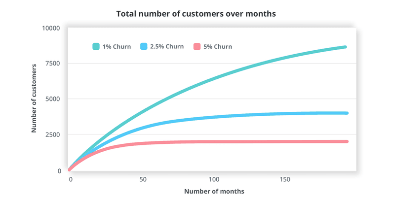
As this graph from Zoho shows, seemingly small differences in churn rates multiply out into big differences in customer numbers. With a constant monthly price, the area under the graph is equivalent to revenue. The more customers you lose early on, the lower the overall revenue generated will be. And it totally makes sense: every customer you acquire incurs you a certain amount of CAC (Customer Acquisition Cost).
In some cases, you can even lose money on new customers:
- If it costs you a significant amount of money to acquire them – e.g. marketing costs, time and money spent getting them set up
- If you offer a free trial – you only generate revenue if they stay beyond the trial period
So, you need to be fighting churn from the very beginning; hence the importance of day one retention.
Why do users churn?
There are many reasons, but the single biggest one is this:
They do not get the value they expected from your service
When a new user signs up with you, she’s excited about the value your SaaS promises to deliver. She’s chosen your service as the solution to a problem she has right now.
One of two things happens now:
- The new user successfully uses your service, achieves the value/solves the problem and the promise is fulfilled. Day one retention problem solved!
- The new user doesn’t manage to use it successfully, she doesn’t achieve the value/solve the problem, is disappointed and is likely to churn.
It is critical to get new users to realize the value from your SaaS as quickly as possible. Excitement about promises will only last for so long – sooner or later it turns into frustration and disappointment. And the gap between expectations and reality is never greater than at the moment that a new user faces the challenge of starting to learn how to use your platform.
SaaS product managers should bear in mind the words of Homer Simpson:

Think of your dashboard as your most valuable piece of real estate. Imagine you’re trying to sell an apartment.
Empty States are like empty apartments, without windows and walls, cluttered dashboards are like cluttered apartments. Both are hard to sell. If you were to sell your apartment, how would you present it to a potential buyer? If your knee-jerk answer is – ‘it depends on whom I want to sell it to’ – you’re on the right track already!
A single young professional in his early 20s vs. a family vs. a real estate investor would need completely different sales materials. Home staging, different ad copy, everything. You’d highlight the proximity of nightclubs to the former vs. schools to the family vs. the ROI to the investor. Because for each of them – your flat would provide different value. Same with your users.
Show them exactly the kind of value they are hoping to get from your app in the form of ready-to-use templates for their use case. That way – your new user will (almost) instantly grasp what they can do with your tool. That’s what we call the ‘AHA! moment’.
To beat day one churn, SaaS companies need to make it as easy and as quick as possible for new users to get to the ‘AHA!’ moment fast. That’s why so many businesses treat Time To Value (TTV) as a core metric.
The rest of this blog is going to look at ways of cutting TTV, one step at a time.
Find out what AHA! means to your users
Day one retention depends on working out what it is your users expect to achieve. That’s their “aha!” – the promise of value that your SaaS offers. A user who has experienced an aha! moment knows what they expect your service to deliver and wants it. We might say they become an Activated user when they actually get there – when they experience that benefit.
But Aha! is not the same for all users. The more complex your SaaS, the wider the range of use cases it is likely to support.
When it comes to day one retention, a new user is probably only thinking about one of them. To activate users as quickly as possible, you need to know which use case is the one that matters to them. If you don’t narrow that down, you could end up like this guy:
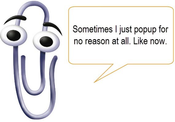
Microsoft’s Clippy was an early attempt at automated onboarding. Every so often, he would pop up and offer advice to Word users. Sounds great, right?
Unfortunately, Clippy was notorious for completely misreading what users were trying to do, or worse yet, just popping up apparently at random, and giving tips unrelated to the task at hand.
The result? Everyone hated Clippy.
Thankfully, we have become much better at working out anticipating user intent in recent years.
Here are there essential ways to segment users by their Aha! needs.
#1 referral paths
You should be segmenting users before they even sign up by tracking the landing pages and referral pathways they have followed.
There are many ways to do this, but the simplest and most popular is using UTM parameters at the end of landing page URLs. This allows you to show pages that look the same to a variety of visitors, but to keep track of what links they followed to get there.
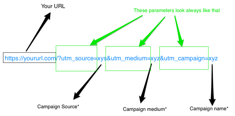
Why does that matter? Because the content on the linked-from page will tell you a lot about why they were interested in visiting you!
That means you can start providing customized onboarding that reflects user expectations from the very beginning.
This is where your marketing and your product management connect. If you’ve made massive claims in your sales process, your users will expect you to live up to them!
The perceptions about the value of your SaaS that new users come onboard with are very much influenced by the sales and marketing they’ve seen. So keep it real!
#2 welcome screen questions
Our State of SaaS 2020 study found that 40% of SaaS products don’t feature a welcome screen for new users at all.
That is a massive “white canvas” mistake!
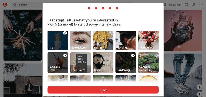
Here’s how Pinterest welcomes new users: with a five-step information gathering process that concludes by asking the user to nominate some topics of interest.
By doing this, Pinterest is able to automatically populate a new user’s feed with relevant images – rather than present them with a blank screen.
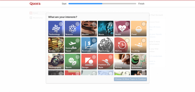
Quora does something very similar. In contrast, Sprout asks new users about their level of experience and what they intend to use their service for.
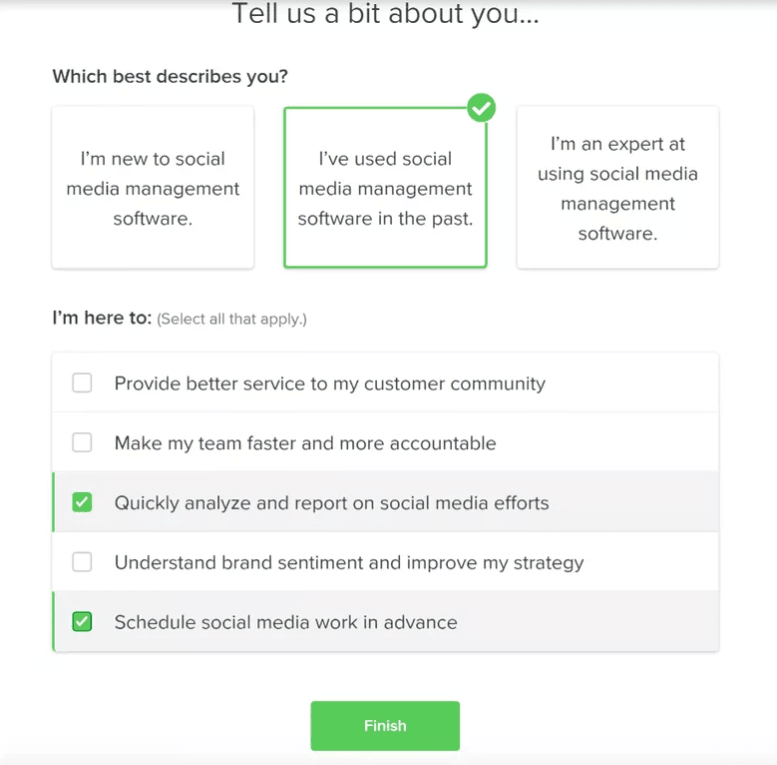
By getting users to tell them these things at the start, Sprout can then customize the onboarding experience for new users and minimize TTV.
#3 contextual in-app help
If you are carefully tracking how a new user is interacting with your platform – using tools like Mixpanel, Heap, Amplitude etc – then you can offer tailored support when it appears that they are attempting a task.
This makes a huge difference to day one retention.
Amazingly, our research shows that this is still not the norm!
Everything you need to know how to convert new and existing users to power users. We're sharing this knowledge from our experience working with 700 SaaS companies.
And yet when it’s used well (pay attention Clippy!), it can help you ease users towards quick wins without having to make all-or-nothing assumptions about predetermined user journeys.
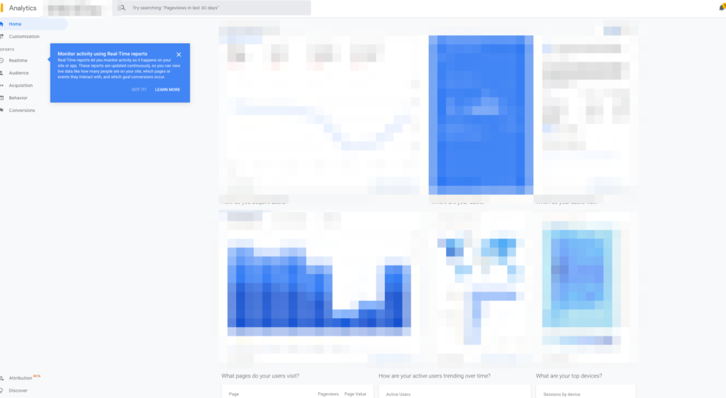
As well as proactively working out what users are trying to do, you should also make it easy for them to tell you.
Set user expectations
Want to earn $1 million?
Here’s the secret…
Get a job that pays $25,000 a year and work non-stop for 40 years!
If your SaaS is offering big value gains, you must set realistic expectations about how long it’ll take and how much effort it’ll need, otherwise, it will be as disappointing as the get-rich-quick advice above.
Chris Savage of Wistia has a great line on this which is worth quoting in full:
Learning to play the piano is hard. Most people never get past the valley of despair. That’s because to truly have fun playing the piano, you want to be able to improvise, make up your own songs, pick up a tune by ear, and entertain yourself with your creativity. Just imagine how much fun it would be to create great music at any moment.
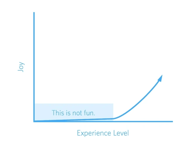
Here’s the secret to getting better at it: you have to measure smaller successes that will generate joy for you along the way, so that you can forge right through the valley of despair.
Checklists may not generate joy, but they do break down the steps involved in becoming a competent user in a brilliantly simple way. By showing the steps a user has still to go through to be able to realize their desired value, onboarding checklists make a big journey seem like a series of small steps.
Salesflare needs users to complete quite a few actions before they start to see any CRM platform benefits.
Each step has a video and a document explaining how to complete it. Completed actions are ticked off and the list will pop up contextually as described in the last section.
Salesflare have even gamified their checklist to make it more fun to complete: adding people to your team and completing tasks extends the duration of your free trial!
Pre-fill some of the fields on your checklist for an extra psychological boost!
If somebody sees that they’ve already completed two out of ten steps, the rest of the journey looks less daunting than if they’ve completed zero out of eight.
Plus, the Zeigarnik Effect has proven that people are predisposed towards remembering and finishing incomplete tasks.
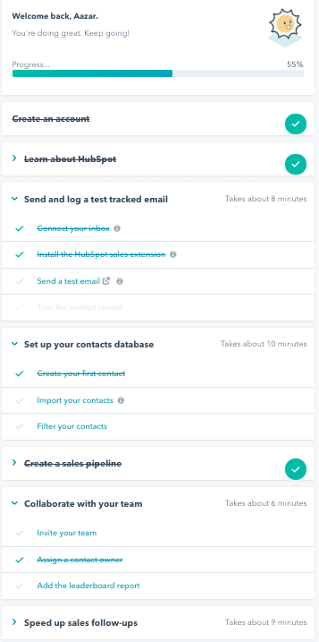
Combine your checklist with a progress bar – like the one above – for extra power.
Having said all that, it’s important to remember Lincoln Murphy’s words here:
"Every customer achieves success in their own timeline."
In this context, that means don’t set your own expectations of your customers too high.
Day one retention is not the same thing as day one activation
Some product managers get hung up on the idea that Activation must be achieved during the first session or on day one. For some products, that’s just not realistic – particularly ones where you have to populate a tool with data or deploy a piece of code onto your website. The TTV will necessarily be a bit longer.
If that’s the case:
- Make it very clear what users have to do and how long it will take them to see the benefit, so that their expectations do not get frustrated
- Be realistic about the amount of effort users can be expected to put in – your day one retention plan can’t depend on a new user putting in a solid eight hours
- Be realistic about how much the user has to do for themselves to get the benefit – this blog talks about one SEO tool that would insert keywords into users’ copy for them if they didn’t do it quickly enough! Not only could that be very irritating, it could prevent the user from learning things they are using the tool to learn.
There’s a balance to be struck. You can’t push users to achieve value at any cost. But you also can't just leave them without any support. The best thing to do is benchmark typical use cases and typical users, map their journeys and TTV figures, and measure new users against those personas.
Reduce time to value (TTV)
OK, hopefully it’s pretty obvious from everything that I’ve said so far that TTV depends on:
- What value a user is looking for
- How quick and easy it is to give it to them
That means the tactics you should pick to minimize TTV and maximize day one retention depend on your users and your product’s use cases.
In this section, we’ll look at some great examples that you can apply to your own needs.
#1 banish empty states
These are the blanks that were mentioned in this blog’s title, there’s nothing more off-putting than all that white canvas when you don’t know where to start.
What Shiv found was that many users really wanted to know how other people were using the tools, in order to inspire their own use.
They solved the problem by including a whole host of pre-built workflows for common use cases.
This increased activation by “double digits”, it’s an approach that lots of other SaaS providers follows.
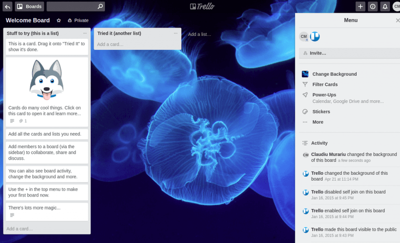
New Trello users are presented with a pre-made board, with the cards showing onboarding instructions.
While Basecamp populates new users’ dashboards with a complete suite of sample data to play with.
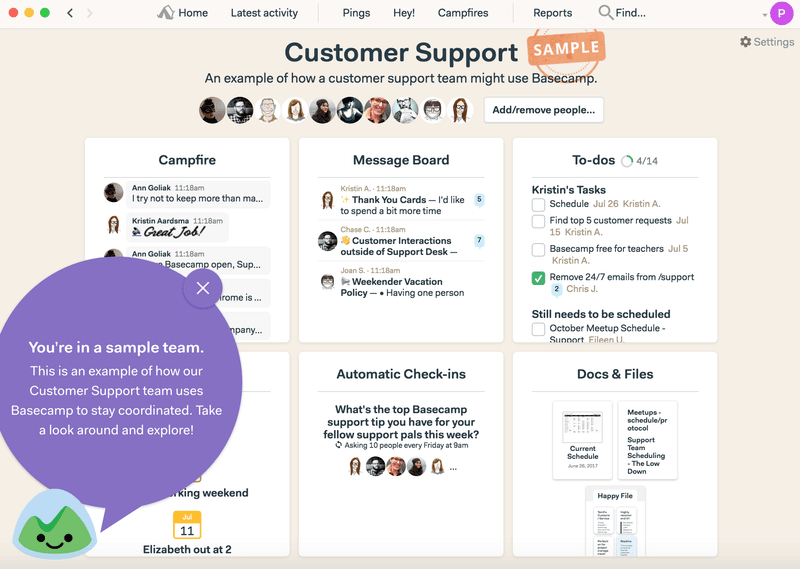
By including sample data or dummy data, these SaaS products make it much easier for new users to get to grips and immediately set expectations about what they can do.
There are other ways to avoid the white canvas trap. Some services force you to take an activating action before you can move on to the main product, like Kissmetrics:
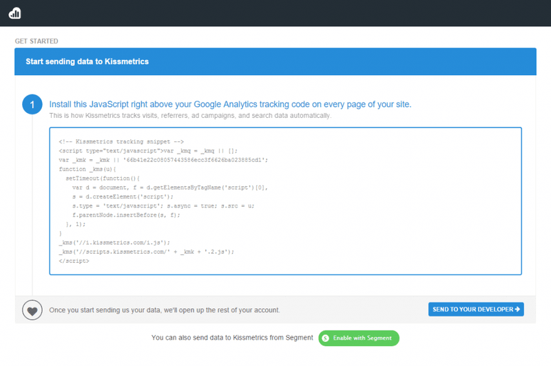
Once the code is installed, Kissmetrics can begin to populate new users’ dashboards with real data.
#2 provide the value in advance
One of the best ways to improve day one retention is to give users value before day one!
Many businesses let users experience some or all of their features before they sign up for a trial or as a customer.
For example, Hubspot cuts TTV to zero with its free Website Grader tool.
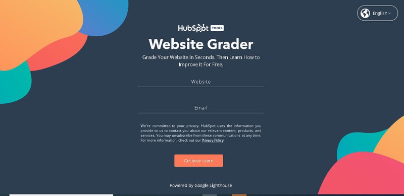
Of course, that’s only a taste of what Hubspot offers, but it immediately makes a positive impression.
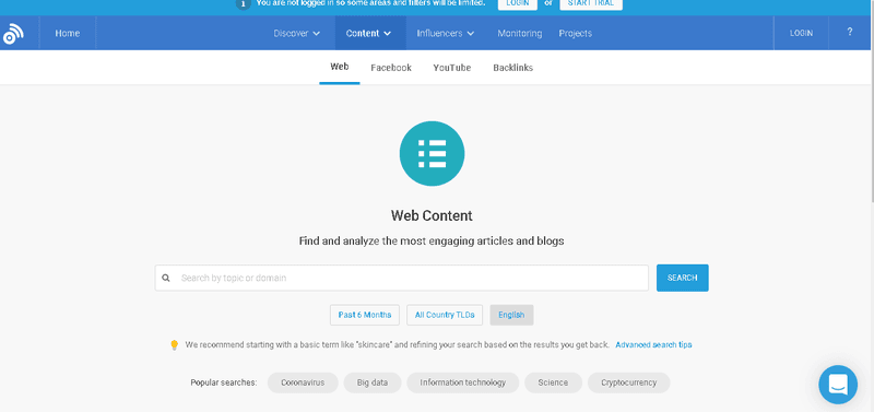
Buzzsumo does something very similar, making some of its tools available before you take out a trial. If you can get users beyond Aha! and on their way to activation before they even sign up, that’s a great start to your day one retention efforts.
#3 Learn by doing
Another great way to avoid throwing day one users in at the deep end is to provide an interactive walkthrough of the essential features and controls.
This gets new users customizing their profiles and inputting their own data in a controlled and supported environment.
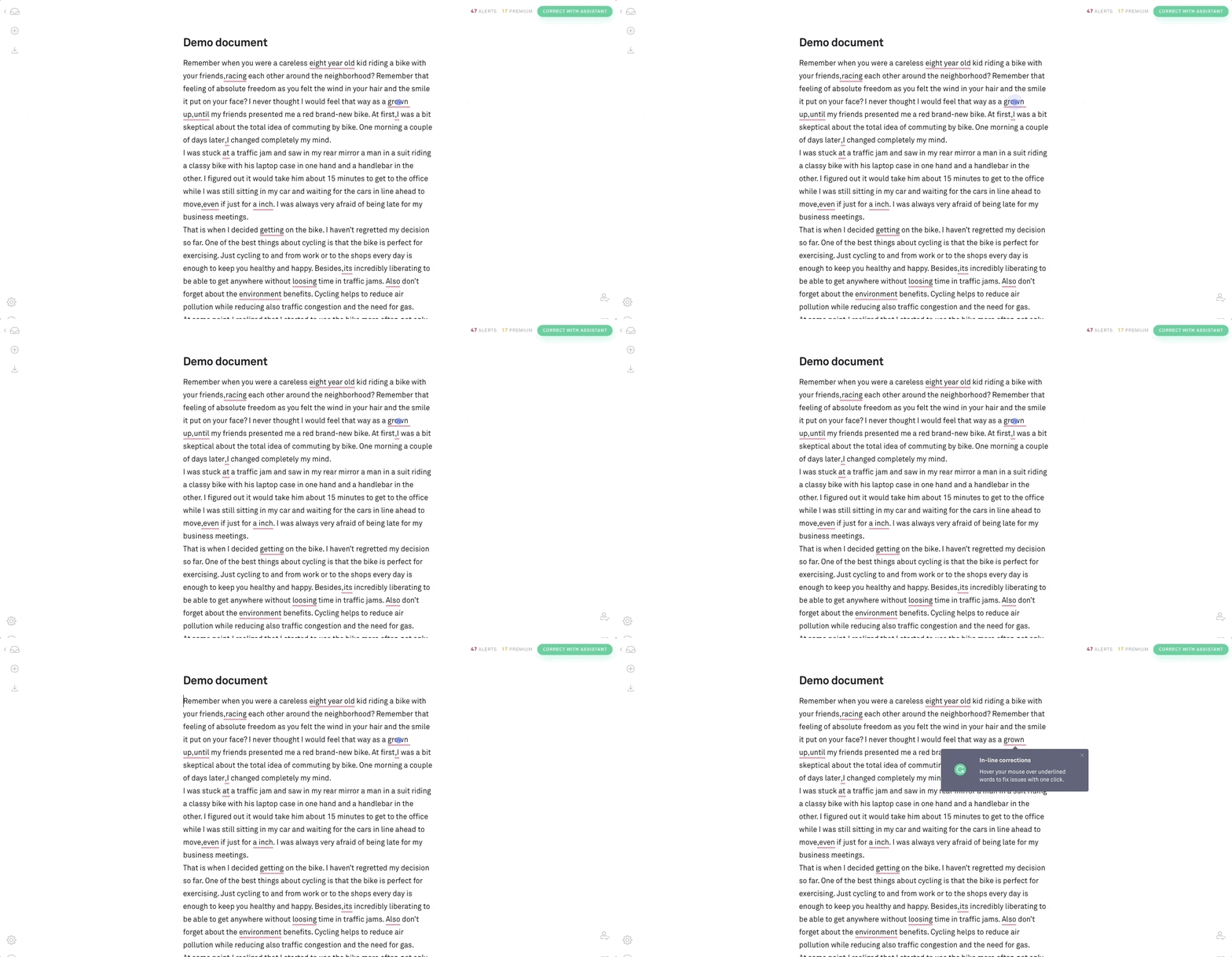
Grammarly does this with a sample document, which leads users to discover the key features.
While Campaign Monitor walks you through the steps involved in setting up a first campaign.
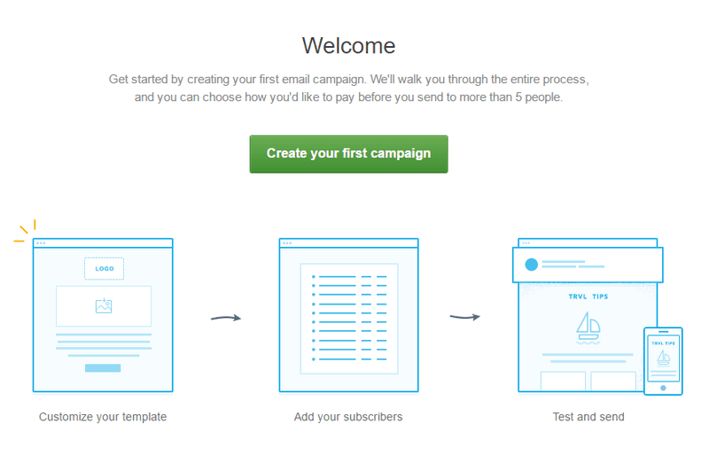
An interative walkthrough is not the same as a product tour. With an interactive walkthrough, users learn by doing – not by watching. This is much more effective.
And of course, it’s entirely possible to put the walkthrough onto your website for people to see before they sign up!
But this can have counter intuitive results. Salesflare saw 15% fewer trials when they did this.
They suspect this is down to better qualifying out of “CRM shoppers” who just want to know what the service can do, but at the time of writing, they don’t have data to back that up.
Give a great experience
It’s not always enough to provide the value quickly. To seal the day one retention deal, you need to go one step beyond and give users a great experience as well.
- Make new users feel valued by welcoming them and onboarding them in the way they want to be onboarded
- Don’t be pushy – keep emails and other interruptions to a minimum at the start, until you’ve built up some kind of relationship
- If you spot red flags (eg not logging in, task abandonment) take pre-emptive action to deal with it and address the problem
- Eliminate friction – make everything as easy for users to complete tasks as possible
- Make your Help Center and other user support resources prominent, responsive and easy to use.












 Follow us on LinkedIn


.svg)
Start the conversation
Become a member of Product Marketing Alliance to start commenting.
Sign up now